

Viral marketing, AI and live shopping: TikTok is the new digital shopping mall
(more…)Category: Blog
-
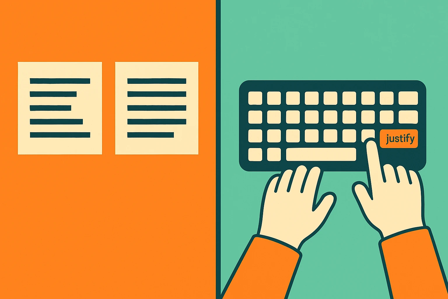
Justify text in WordPress
Do you want justified text in WordPress but the option seems gone?
In this video tutorial my favorite method. In the article you will find other alternative solutions.
(more…) -

How to Write an Effective About Us Page
The About Us page is one of the most visited sections of any website—and one of the most underestimated. A compelling story, a human touch, and clear communication are all key to transforming a casual visitor into a potential client.
In this article, you’ll discover how to write the About Us page, how to structure it, which visual elements to use, and what makes the best About Us pages truly effective.
(more…) -

Gmail scam alert: fake tech support trick is stealing your recovery codes
Phishing emails and fake Google calls are compromising accounts—here’s how the scam works and how to stay safe
(more…) -

APT41: when espionage becomes business
The Chinese hacker group turning every vulnerability into an attack opportunity
In the vast ecosystem of advanced cyber threats, APT41 stands out not only for its longevity but also for its unique ability to blend state-sponsored espionage with profit-driven cybercrime. Known by names such as Wicked Panda, Earth Baku, or Bronze Atlas, this fluid entity represents a new type of threat: hybrid groups, backed by governments but operating like cyber gangs.
Two faces: intelligence and income
APT41 isn’t just a branch of Chinese cyber intelligence—it’s a revenue engine. Agile in both state and criminal cyber spheres, they’ve hit healthcare systems, tech firms, manufacturing industries, and even educational infrastructure. Not for ideology. For gain.
Malware with intent: KeyPlug, ShadowPad, TOUGHPROGRESS
Their toolkit is among the most refined:
- KeyPlug, a cross-platform modular backdoor with customizable C2 channels.
- ShadowPad, the customizable RAT and spiritual successor to PlugX.
- TOUGHPROGRESS, malware that hides commands in Google Calendar events, making data exfiltration invisible.
Free hosting, cloud, and forums: infrastructure everywhere
APT41 knows how to weaponize legitimate online services:
- Cloudflare Workers mask C2 servers.
- Data exfiltration flows through Google Drive.
- Dead drop resolvers post hidden C2 addresses on public tech forums.
Surgical strikes, rapid exploits
The group reacts at lightning speed to newly published vulnerabilities. With Log4Shell, they were active mere hours after the CVE advisory. They’ve also crafted bespoke exploits for niche software, showing military-grade R&D capacity.
Global targets: healthcare, education, industry, logistics
Earth Baku, one of APT41’s cells, brought operations to Europe and the Middle East. Italy has been among the targets. Their scope is broad: no longer just defense and energy, but also universities, hotels, clinics, and factories.
Defense is possible—but method is key
Fighting APT41 requires more than firewalls or antivirus. You need:
- Behavioral analytics, as their malware blends in too well.
- Rapid patching, because every day of delay is dangerous.
- Zero trust architectures, to isolate lateral movements.
- Hardened devices, since they love hitting forgotten network gear.
The future: more AI, less attribution
APT41 is preparing to use artificial intelligence to fool ML-based defense systems. They’re also refining methods to avoid attribution. You may not even know you’re being attacked.
Cybersecurity is no longer just technical—it’s geopolitical. And groups like APT41 remind us that every click is a potential breach, every unpatched system a welcome mat.
-

The file wp-config.php already exists? Clear Aruba cache
When WordPress works… but only on your computer
You’ve just installed WordPress on a brand new domain. The backend works: plugins install, pages load, content saves, and everything seems just fine.
But when you try to open the site from a smartphone or another device, an error message appears. Something like this:
“The file wp-config.php already exists. If you need to reset any configuration in this file, delete it first. You can try to install now.“
Confused? You’re not alone. This was the issue faced on impresaindustria.it, and here’s what solved it.
The real issue: Aruba’s HiSpeed Cache
When using Aruba hosting, the platform activates something called HiSpeed Cache by default. This server-side caching can sometimes store a “stuck” or broken version of your website — especially after a fresh installation.
That means even though your WordPress dashboard works perfectly, the public-facing site may appear broken or display strange installation messages.
The fix: Clear server-side cache
Here’s how the issue was resolved in this real case:
- Log in to your Aruba control panel
- Navigate to HiSpeed Cache
- Click “Cancella cache” (Clear Cache)
- Refresh the site from another device
Problem solved. The site became immediately visible from all devices.
How to avoid it next time
After installing WordPress on Aruba, always clear the server cache before checking your site externally. Also, avoid relying only on your own browser – test your site from another network or device to make sure it’s accessible.
Dopstart can help
Having WordPress issues that don’t make sense? Dopstart offers a free initial consultation to help you diagnose and fix visibility and performance problems. From installation to SEO optimization, we’re your partner in the digital journey.
FAQ
1. Why can I only see my WordPress site from one device?
Because of server-side caching. Your computer may show a cached version, while others get an error due to outdated or broken cache.2. What does the wp-config.php error mean?
It usually means WordPress was already installed. But if the site works in the admin panel, the error is likely caused by cache issues rather than file problems.3. What is Aruba’s HiSpeed Cache?
It’s a server-side caching system designed to speed up site loading. However, it can sometimes interfere with new installations if not cleared.4. How do I clear the Aruba cache?
Log in to the Aruba control panel, go to the HiSpeed Cache section, and click “Cancella cache”.5. Do I need to delete wp-config.php manually?
Not necessarily. If the site works in admin, the problem likely lies in the cache. Try clearing it first before deleting files.6. Is this a common problem with Aruba hosting?
Yes, especially for users unfamiliar with Aruba’s default caching settings. It’s easily fixable once you know where to look.7. Does clearing the cache delete any data?
No, it simply refreshes the cached version of the site. All your content and settings remain untouched.8. Should I always clear the cache after installing WordPress?
It’s highly recommended when using hosting with server-side caching like Aruba, to ensure everything displays correctly.9. Can this issue happen with other providers too?
Yes, any hosting with aggressive caching systems (like Varnish or Cloudflare) can present similar issues if cache isn’t purged.10. Can Dopstart help with other WordPress issues too?
Absolutely. We assist with installations, migrations, performance optimization, SEO, and long-term digital strategy. -

UI Design: cos’è e come si fa?
In this article, we’ll explore what User Interface Design (UI Design) is, why it’s crucial to the success of a digital product, and how it differs from User Experience Design (UX Design). We’ll also look at the fundamental principles of creating intuitive, accessible, and aesthetically pleasing interfaces.
Table of Contents
- What is User Interface (UI) Design? (In-Depth with Examples)
- UI vs UX Design: a Key Distinction
- How to Design an Effective Interface
- The Power of Invisible Design
- The Importance of Emotion in UI Design
- Responsive vs Adaptive Design
- Responsive vs Adaptive Design
- Why rely on Dopstart?
- Questions and Answers
What is User Interface (UI) Design? (In-Depth with Examples)
User Interface (UI) Design is the process of designing interfaces through which users interact with digital products—such as websites, apps, voice assistants, or augmented reality systems.
The core goal is to combine functionality and visual appeal, ensuring that the interaction is intuitive, efficient, and even delightful. Good UI design isn’t just about how things look—it’s about making sure people can use them easilyand without confusion.
Graphical User Interfaces (GUI)
GUIs are the most common type of user interfaces. They include everything the user sees and touches: buttons, icons, sliders, menus, forms, and layout structures.
Practical Example – E-commerce Website:
Think of Zalando. The UI is clean, with a simple menu, large product images, and clearly defined call-to-action buttons like “Add to Cart.” A well-designed UI helps reduce cart abandonment and ensures the user finds what they’re looking for in just a few taps or clicks.Practical Example – Mobile App:
On Instagram, the UI puts the content front and center. Only a few, intuitive buttons guide the experience. The heart icon for liking a post is positioned right where your thumb naturally rests—a classic example of mobile-first UI design.Voice-Based Interfaces (VUI)
VUIs let users interact using voice, often with no visible interface at all.
Practical Example – Smart Assistants:
When you say, “Hey Siri, turn on the lights in the kitchen,” the system interprets your command and responds. Even though there’s little to no visual feedback, the interface still exists—it’s in the way the system listens, processes, confirms, and acts. A great VUI design ensures the assistant understands natural speech and provides timely, accurate responses.Gesture-Based Interfaces
These interfaces let users interact via body movement, common in virtual or augmented reality.
Practical Example – Meta Quest (Oculus VR):
In Meta’s virtual environment, you can grab, swipe, or throw virtual objects using your hands. Designing for this space requires thinking in 3D: gestures must feel natural, actions must provide feedback (like vibrations or visual cues), and the system must minimize motion fatigue. This is UI design without buttons, but it’s still design in every sense.The “Invisible” UI Concept
A well-designed UI should almost disappear—not because it’s minimal, but because the user doesn’t have to think about how to use it. It just works.
Example – Domino’s Zero Click App:
Open the app, and your favorite pizza is ordered in seconds—no buttons, no forms. The interface is barely there, yet it delivers maximum usability by predicting what the user wants.A strong UI Design:
- guides users without overwhelming them;
- anticipates user intent;
- reduces friction and cognitive load;
- reflects the brand’s identity visually;
- works seamlessly across devices (desktop, mobile, smartwatches, TVs, AR/VR platforms).
If you’re wondering whether your interface is doing its job, Dopstart offers a free first consultation to help you evaluate and redesign your site or app for better clarity, usability, and engagement.
Would you like to continue with a dedicated section about how to test and improve your UI or go deeper into tools like Figma and Material UI?
UI vs UX Design: a Key Distinction
UI and UX design are often used interchangeably, but they’re two distinct yet complementary disciplines essential in digital product design.
What is UX design?
UX stands for User Experience Design. It covers the entire journey a user goes through when using a digital product—how it feels, how easily goals are achieved, and how satisfied the user is.
A UX designer focuses on:
- mapping user needs through personas and user journeys;
- structuring flows and interactions;
- identifying friction points;
- running usability testing.
What is UI design?
UI stands for User Interface Design. It deals with the visual and interactive side of the experience—what users seeand touch.
A UI designer works on:
- color palettes, typography, spacing;
- buttons, icons, layout, and grids;
- interaction feedback (click, hover, swipe);
- maintaining visual consistency across the product.
The car metaphor
Think of a car:
- UX is the whole driving experience—from how comfortable the seat is, to how easy it is to park, to how safe you feel on the road.
- UI is the dashboard and controls—the steering wheel, pedals, gear stick, and how the interface communicates with you.
A beautiful interface without usability is like a sports car with no steering wheel. But even the best driving logic won’t work if the controls are clunky or confusing.
They work hand in hand
In any good design team:
- The UX designer defines the structure and strategy.
- The UI designer brings it to life visually.
Together, they shape a seamless, engaging, and useful product.
How to Design an Effective Interface
Designing a great user interface means balancing functionality, clarity, and aesthetic consistency. First, know your audience: What are their goals? Are they tech-savvy? Do they have any disabilities or special needs?
Here are the key principles:
1. Simplicity
Keep interfaces simple and focused. Every element must serve a purpose. Eliminate clutter and distractions.
Example:
A login form with only essentials.<form>
<label for="email">Email</label>
<input type="email" id="email" placeholder="Enter your email">
<label for="password">Password</label>
<input type="password" id="password" placeholder="Enter your password">
<button type="submit">Log in</button>
</form>2. Consistency
Maintain consistent styling throughout the interface: colors, typography, button styles, spacing.
Example:
Your call-to-action button should always look the same.button.cta {
background-color: #FF6600;
color: white;
font-size: 18px;
padding: 12px 20px;
border-radius: 8px;
}3. Accessibility
Design for all users, including those with disabilities. Use proper contrast, semantic HTML, and keyboard support.
Example:
Accessible button witharia-label.<button aria-label="Add to cart">
<immagine carrello>
</button>body {
background-color: #fff;
color: #111; /* Good contrast ratio */
}4. Instant Feedback
Interfaces must respond immediately to user input—hover effects, loading animations, confirmation messages.
Example:
A button reacts when clicked.button:active {
transform: scale(0.98);
background-color: #cc5200;
}5. Visual Hierarchy
Use typography, spacing, and color to lead the eye and highlight the most important actions.
Example:
Hierarchy through font size and placement.<h1>Discover Our Platform</h1>
<p class="subtitle">Faster, simpler, safer.</p>
<button class="cta">Get Started</button>{ font-size: 32px; margin-bottom: 10px; } .subtitle { font-size: 18px; color: #666; }The Power of Invisible Design
One of the golden rules in User Interface Design is:
“Great design is invisible.”
An effective UI doesn’t draw attention to itself—it lets the user focus entirely on their task. When the interface becomes second nature, it disappears from the user’s awareness.
What is invisible design?
Invisible design is a philosophy that emphasizes effortless interaction. It reduces friction by making the interface intuitive, self-explanatory, and context-aware.
Users don’t need to learn how it works.
The system adapts to the user, not the other way around.
Every step feels natural, like second nature.Real-world example: Domino’s Zero Click App
Domino’s Zero Click App is a brilliant real-life case.
Once set up, you just open the app and wait 10 seconds. Your default pizza gets ordered—automatically.
There are no visible interactions, no need to confirm or tap anything. That’s invisible UI: the app knows what you want and acts without asking.
More examples of invisible design
- Smart autocomplete in search engines: it predicts what you’ll type.
- Auto-save in Google Docs: you don’t even notice it saving, but it never loses a word.
- Swipe gestures in Gmail app: no explanation needed, just swipe to archive.
How to create an invisible interface
- Use familiar icons and patterns that don’t need explanation.
- Cut out unnecessary steps.
- Provide discreet feedback (e.g., subtle animations, gentle haptic feedback).
- Anticipate user needs with smart defaults and predictive actions.
- Maintain design consistency across platforms and screens.
The Importance of Emotion in UI Design
In User Interface Design, we often focus on functionality, usability, and performance. But there’s one element that truly defines user loyalty and satisfaction: emotion.
Interfaces speak to emotion
Every user interaction with a digital product triggers an emotional response. That emotion—positive or negative—sticks with your brand.
A joyful experience → keeps users coming back
A frustrating one → pushes them awayDesign isn’t just about what works. It’s about how it makes people feel.
Emotional design in action
- Duolingo uses animations and encouraging phrases: “You’re a star!” → users smile and feel accomplished.
- Spotify suggests playlists like “Your 2024 Summer” → nostalgia and personal relevance.
- Airbnb shows warm photos with phrases like “Feel at home, anywhere” → comfort and trust.
How to design for emotion
- Use friendly microcopy instead of cold error codes (e.g., “Oops! Let’s try that again”).
- Add subtle animations or illustrations to humanize the interface.
- Choose colors and fonts that match your emotional tone (e.g., warm = friendly, dark blue = trust).
- Provide visual rewards for positive actions (e.g., confetti animation after completing a task).
Remember
Users forget what they clicked—but remember how they felt.
Designing for emotion is not decoration—it’s strategy.
Responsive vs Adaptive Design
In today’s digital landscape, users access websites and apps from phones, tablets, laptops, TVs, and even smartwatches. That’s why responsive and adaptive design are both essential.
What is responsive design?
Responsive design uses a single interface that flexibly adjusts to different screen sizes using CSS media queries, fluid grids, and scalable content.
Example:
An online store shows 4 items per row on desktop, 2 on tablet, and 1 on mobile. The HTML remains the same, but styles change according to the screen width..product {
width: 25%;
}
@media (max-width: 768px) {
.product {
width: 50%;
}
}
@media (max-width: 480px) {
.product {
width: 100%;
}
}What is adaptive design?
Adaptive design delivers distinct layouts based on the detected device or screen size.
It’s more device-specific, where the system loads different versions of the UI.Example:
A travel booking app offers a complex desktop version and a simplified mobile version with touch-friendly buttons and linear navigation.Key differences
Feature Responsive Design Adaptive Design Technical approach One flexible layout Multiple tailored layouts Screen adaptation Fluid and dynamic Predefined breakpoints Development speed Faster More complex Real-world example WordPress websites Airline or banking app Best practices
- Design mobile-first, then scale up.
- Use relative units like
emand%. - Apply strategic breakpoints (480px, 768px, etc).
- Ensure buttons are tap-friendly.
- Test on real devices, not just emulators.
Responsive vs Adaptive Design
In today’s digital landscape, users access websites and apps from phones, tablets, laptops, TVs, and even smartwatches. That’s why responsive and adaptive design are both essential.
What is responsive design?
Responsive design uses a single interface that flexibly adjusts to different screen sizes using CSS media queries, fluid grids, and scalable content.
Example:
An online store shows 4 items per row on desktop, 2 on tablet, and 1 on mobile. The HTML remains the same, but styles change according to the screen width.cssCopiaModifica
.product {
  width: 25%;
}
@media (max-width: 768px) {
  .product {
    width: 50%;
  }
}
@media (max-width: 480px) {
  .product {
    width: 100%;
  }
}
What is adaptive design?
Adaptive design delivers distinct layouts based on the detected device or screen size.
It’s more device-specific, where the system loads different versions of the UI.Example:
A travel booking app offers a complex desktop version and a simplified mobile version with touch-friendly buttons and linear navigation.Key differences
Feature Responsive Design Adaptive Design Technical approach One flexible layout Multiple tailored layouts Screen adaptation Fluid and dynamic Predefined breakpoints Development speed Faster More complex Real-world example WordPress websites Airline or banking apps Best practices
- Test on real devices, not just emulators.
- Design mobile-first, then scale up.
- Use relative units like
emand%. - Apply strategic breakpoints (480px, 768px, etc).
- Ensure buttons are tap-friendly.
Why rely on Dopstart?
Designing an interface that works is not improvisation. If you are developing an app or a website, Dopstart offers an initial free consultation to analyze your project, identify critical issues and build a winning UI strategy together. We accompany you in all phases, from the idea to the launch.
Questions and Answers
- What is UI design? It is the design of the user interface for software, apps and digital devices.
- What is the difference between UI and UX? UI is about the visual aspect and interaction, UX is the entire user experience.
- Do you need to know how to code to do UI design? Not necessarily, but knowing HTML and CSS is a plus.
- What tools does a UI designer use ? Figma, Sketch, Adobe XD, InVision, among others.
- How much does a UI designer earn? In the US the average salary is over $75,000 a year.
- Is UI design suitable for beginners? Yes, with practice and study you can start even as a self-taught.
- What are the basic principles of UI design? Simplicity, consistency, accessibility, feedback and visual hierarchy.
- How can I improve in UI design? Practice, study, get feedback and take specialized courses.
- Are there any interfaces that are not graphical? Yes, voice and gestures are examples of non-graphical UIs.
- What makes an interface effective? Being easy to use, intuitive and visually pleasing.
-

How ChatGPT is rewriting digital marketing rules
With generative AI on the rise, winning mentions is now the key to online brand visibility
The silent shift: people are shopping through ChatGPT
We’re no longer just searching—we’re talking. More and more consumers are shopping by chatting with large language models like ChatGPT, forcing digital marketers to evolve. Say goodbye to SEO-only tactics and hello to a world where brand mentions, reputation, and AI-readable storytelling take center stage.
This trend is explored in depth in a Fortune article by Stuart Dyos, who highlights how generative AI is reshaping not only the way people shop, but also how brands must be discovered online.
SEO is no longer enough—it’s time for mention marketing
Traditional SEO optimized for Google’s ranking systems. But LLMs like ChatGPT operate differently: they extract answers from third-party content, forums, social media, and product reviews.
To appear in these AI-generated responses, your brand must be talked about positively, consistently, and authentically across the web.
ChatGPT and Amazon: the emerging duo
According to the Datos data reported by Dyos in Fortune, from October to January Amazon was the top domain referred by ChatGPT search results, accounting for 9.13% of all traffic. A clear signal that AI-assisted shopping is gaining traction.
Even if Google claims search traffic isn’t declining, proactive brands are already adjusting their strategies.
The new frontier: brand reputation in the AI age
Christine Wetzler put it best: “Credibility is being built outside your site now.” So what matters is not just your homepage, but also what people—and AI—say about you online.
As Lauren Petrullo warns, “If your company isn’t correctly represented, AI will fill in the blanks—often inaccurately.”
The solution: brand storytelling, not keyword stuffing
Today’s priority is to craft a consistent, engaging brand narrative. Companies like Hawke Media are teaming up with AI specialists like Gumshoe to simulate and analyze brand mentions in thousands of AI conversations. This is the new digital battleground.
-
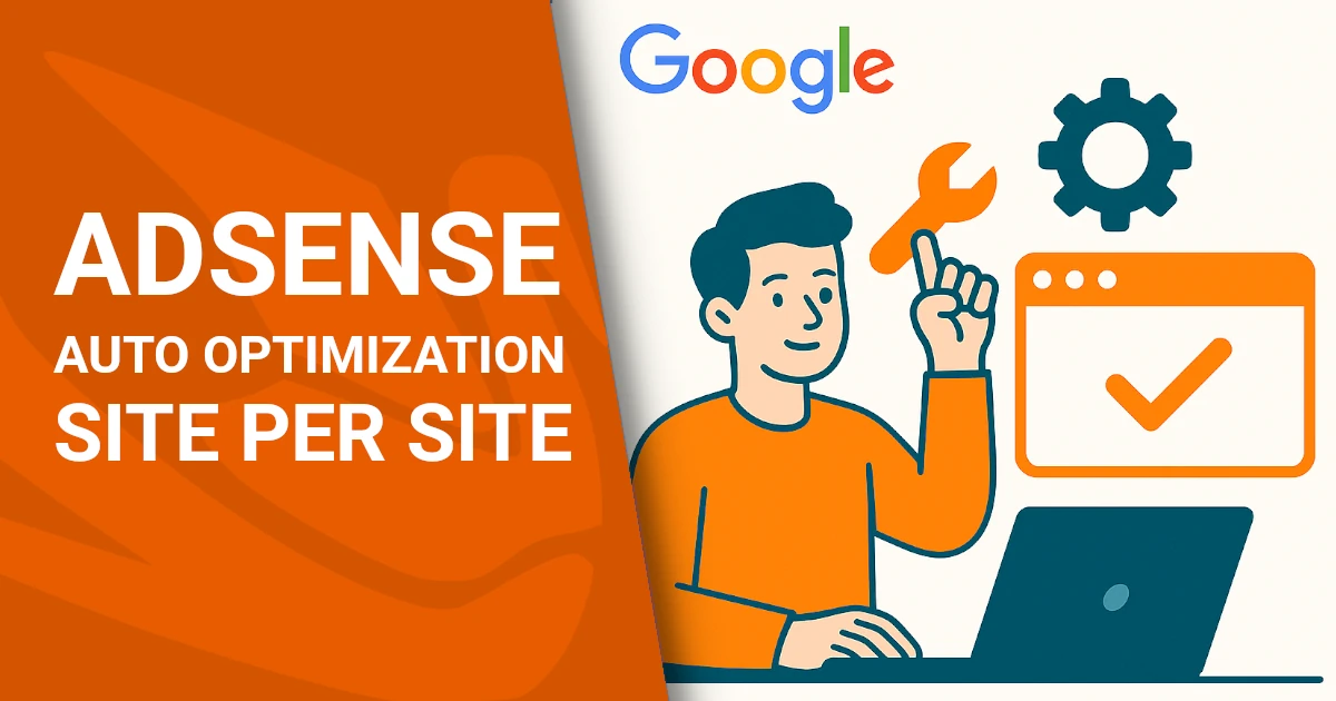
Google revamps AdSense: auto optimization now customizable per site
The latest update from Mountain View gives publishers greater control over advertising experiments and a more flexible interface
A major shift in experiment management for publishers
Google has announced a significant update to the auto optimization feature in AdSense, following widespread requests from publishers seeking more control over advertising experiments. The tech giant confirmed that the update will roll out progressively over the coming weeks and will apply to all existing accounts.
Auto optimization now managed on a site-by-site basis
The most notable change is the introduction of per-site control over auto optimization. Publishers can now enable or disable the feature individually for each domain they manage. Previously, optimization settings were global across all sites linked to an AdSense account, with no option for differentiation.
When the update is applied to an account, existing optimization settings will be carried over to all connected sites by default.
Settings moved from “Experiments” to “Ads” page
The auto optimization settings have been relocated from the Experiments page to the Ads section within AdSense. A new dedicated column has also been introduced, allowing publishers to see at a glance which sites have the feature active.
A new approach to experiment application
The previous “Only suggestions” setting has been removed and replaced with a checkbox labeled “Automatically apply the best setting from the experiment.” This gives publishers a clear choice: allow Google to implement its preferred result or retain full manual control over site settings.
New sites default to optimization, but it’s optional
Any new site added to AdSense will now have auto optimization enabled by default, with the “automatically apply best setting” option selected, 50% of traffic included in tests, and no experiments blocked. However, publishers retain the option to disable this feature at any time.
Updates also apply to AdSense for Search (AFS)
Publishers using AdSense for Search (AFS) will also see changes. Auto optimization settings have been moved to a dedicated page accessible from the main “Experiments” menu. These settings remain account-level configurable, allowing centralized management of all search ad experiments.
A flexible strategy for a complex digital ecosystem
With these changes, Google reaffirms its commitment to a more transparent and adaptable experience for its business users. The goal is clear: maintain the performance benefits of automation while restoring control to the hands of those who manage websites and monetization strategies daily. This move reflects the evolving complexity of the digital advertising landscape and the growing need for customizable solutions.